Entry tags:
- art,
- fanart,
- harry potter,
- ramble,
- tarot
HP Tarot thumbnails - Wheel of Fortune
WHEEL
OF
FORTUNNNNNNEEE
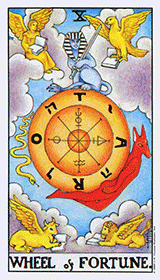
The Wheel of Fortune represents a turning point in one's life that may be due to chance, where "anything could happen". I have the Sorting Hat in its place because it's what determines a large part of a student's developmental path throughout their teenage years, and <insert rant about Hogwarts system of segregation and self-fulfilling prejudices>
Notable art bits:
1. Hey look, I made a wheel-ish image. Originally I was just going to have the Sorting Hat sitting upright like normal, but when I went to draw it I suddenly had the inspiration to draw it from the top so it'd be circular. Does it work, guys?
2. The traditional Wheel of Fortune card has four angelic animals/figures in the four corners, which are apparently icons ofRingo, Paul, George, and John Matthew, Mark, Luke, and John, and/or possibly representing the four elements. I've got the four House mascots (in the order of the Hogwarts crest) because they represent the "destinies" that the Sorting Hat will assign people into, plus they're also each of the minor suits.
3. Each of the mascots is also pulling back a corner of their "background" to beckon you into their House. OH LOOK AREN'T I SO CLEVER
4. Eagle sucks and needs redo. I really suck at drawing birds (or at least wings), even with reference. This problem will crop up again. And again.
OF
FORTUNNNNNNEEE
-----
"There's nothing hidden in your head
The Sorting Hat can't see,
So try me on and I will tell you
Where you ought to be." - The Sorting Hat

"There's nothing hidden in your head
The Sorting Hat can't see,
So try me on and I will tell you
Where you ought to be." - The Sorting Hat
The Wheel of Fortune represents a turning point in one's life that may be due to chance, where "anything could happen". I have the Sorting Hat in its place because it's what determines a large part of a student's developmental path throughout their teenage years, and <insert rant about Hogwarts system of segregation and self-fulfilling prejudices>
Notable art bits:
1. Hey look, I made a wheel-ish image. Originally I was just going to have the Sorting Hat sitting upright like normal, but when I went to draw it I suddenly had the inspiration to draw it from the top so it'd be circular. Does it work, guys?
2. The traditional Wheel of Fortune card has four angelic animals/figures in the four corners, which are apparently icons of
3. Each of the mascots is also pulling back a corner of their "background" to beckon you into their House. OH LOOK AREN'T I SO CLEVER
4. Eagle sucks and needs redo. I really suck at drawing birds (or at least wings), even with reference. This problem will crop up again. And again.
no subject
2. "
Ringo, Paul, George, and John" Somebody's been watching Midsomer Murders... more seriously, I like the idea, and it fits well with what the Sorting Hat does.3. I thought those were just the edges of a circular table.
4. It's rather hard to make out the eagle - there's just not enough contrast with the colours in that corner.
no subject
2. I have no idea what you're talking about
3. Err... more refined shading? ^^;
4. Ravenclaw's always had the crappy color scheme. I plan to be painting the mascots like (mostly) real animals, so the eagle will get darker and stuff. But first I just gotta figure out how to draw it. ^^;;
no subject
2. Midsomer Murders is a British detective drama set in many rural English villages full of upper-class snobbery turned up to 11. Hilarity and a high body count ensues, usually over pointless little things like membership of the Midsomer Photography Society or who won the trophy for the best garden.
The latest episode of Midsomer Murders (broadcast last Wednesday) had a plot involving forged paintings. The forger had taken care to make a deliberate mistake in every forging - things like painting a scene that doesn't fit with the supposed date of the painting, or leaving little in-jokes. In one painting, the 'mistake' was the four swine-herders were actually the Beatles. Co-incidence or what?
3. That would help. Possibly also make the part that's pulled back a bit bigger. At first glance, it looks rather like the corners in my current userpic (which is a deliberate vignetting effect I tried).
4. What about making the blue lighter then?
no subject
4. The blue is already kind of set in stone and is already a lighter shade than most flags/banners/coats of arms. I think the problem is mostly the eagle form sucking! Which will (hopefully) be remedied!
no subject
no subject
no subject
http://www.paulnoll.com/Oregon/Birds/flight-shape.html
(I have a random selection of websites like those in my favourites left over from when I did art ^^; )
I like how you've done the concept for this card though :)
no subject
I have plenty a collection of my own reference photos too that I'll be going through when I sit down to work on these cards. Someday it will break through my thick skull.
no subject
Yeah, the pulling at corners thing is not-that-obvious in thumbnail form. I thought that they were just on a thusly shaped banner.
The sorting hat as wheel-shaped is nifty, and I'm sure will look good in more en-biggen-ed form.